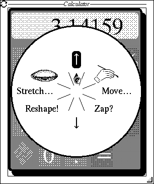
IIRC it is 1988, and James Gosling and I are in the Sun Microsystems booth at SIGGRAPH demo-ing the NeWS window system. Don Hopkins walks up with a tape cartridge in his hand and says "load this". Knowing Don, we do, and all of a sudden all the menus in the system are transformed from the conventional pull-right rectangles to circles divided into pie-slices. And Don, at that time the most caffeinated person I'd ever met, is blazing through the menus faster than we've ever seen before.
Why am I writing this thirty years later? Follow me below the fold.
Two weeks ago Don posted
Pie Menus: A 30 Year Retrospective. It starts:
Today (May 15, 2018) is the 30 year anniversary of CHI’88 (May 15–19, 1988), where Jack Callahan, Ben Shneiderman, Mark Weiser and I (Don Hopkins) presented our paper “An Empirical Comparison of Pie vs. Linear Menus”. We found pie menus to be about 15% faster and with a significantly lower error rate than linear menus!
This should not have been a surprising result. As Don writes, it is a consequence of
Fitts' Law:
the bigger and nearer by the target, the faster and more accurately you
can hit it. Pie menus maximize the target size, and minimize the target
distance!
Don's post is fascinating, full of examples and links to valuable human interface work. You should read and enjoy the whole thing. Even if you don't want to read Don's post, you absolutely have to watch the
video of Simon Schneegans' Gnome-Pi, a beautiful implementation of pie menus for Gnome.
But I can't resist this snippet. Don recalls that:
On
October 25, 1988, I gave Steve Jobs a demo of pie menus, NeWS, UniPress
Emacs and HyperTIES at the Educom conference in Washington DC. His
reaction was to jump up and down, point at the screen, and yell “That
sucks! That sucks! Wow, that’s neat! That sucks!”
I
tried explaining how we’d performed an experiment proving pie menus
were faster than linear menus, but he insisted the linear menus in NeXT
Step were the best possible menus ever.
Jobs' expertise in the design of menus can be illustrated by the following story, which I hope I recall correctly. The then (and still) canonical way sub-menus work is that they pop up with their top aligned with their parent menu item, so that the most frequent choice at the top of the sub-menu is closest. But Jobs thought that this looked messy, so on the NeXT they popped up with their top aligned with the top of the parent menu. Everyone else at NeXT knew this was bogus, so one time when Jobs was on the road they fixed the menus to work right. When he got back he went ballistic and made them unfix the menus.


4 comments:
Makes sense once you're not working on a character-based computer!
Slightly related, my favourite note taking and document planning tool since early in my working life was the mind map. You put the concept in the centre and elaborate radially. It's great virtue for me was eliminating top-left and prior though bias; you fit a new idea where it best fits rather than (by default) at the end. It was particularly useful with later version of mind map software (better than white boards, invaluable though they were) which move stuff around to accommodate new, and allow you to drag ideas around the place. Then (after retirement) Apple dumped backwards compatibility, my software stopped working, and the company had radically changed (worsened) the design and changed to an unaffordable rental model. So now I'm back to paper when I need to plan anything. Oh well.... :-)
Don Hopkins' research into the pre-history of pie menus traced them back to a system called PIXIE, developed in 1967 at Cambridge by Neil Wiseman and his students on the PDP-7 + DEC 340 display system that I used as an undergraduate.
Now, Don has worked with a librarian at Cambridge to unearth and digitize two movies of PIXIE in action, and has set excerpts to music here.
Permanent links to the two PIXIE movies are one and two.
Thank you for your kind words, David! I couldn't have done any of that stuff without your groundbreaking work paving the way without any speed limit signs!
I love Chris Rusbridge's point, and how pie menus relate to mind maps is an idea I've been iterating on with different systems over the years.
The question of "How do you design a pie menu editor" is a difficult one, because they don't lend themselves to one-dimensional scrolling lists like most user interface editor dialogs use.
For example, here is a great solution to editing a nested tree of linear menus that HyperLook used, using one multi line text editor: Simply type in your menu tree as an indented outline. It parses the outline and produces a corresponding tree of nested linear menus! Easy peasey!
But when you try to apply that idea to nested pie menus, things become more twisted (or rather you need them to be twisted, but they are straight)!
It's extremely hard to visualize which direction each item will lie in, when formatting the items as a linear list, like an outline, or a vertical scrolling list.
So I've always wanted to design a better visual two-dimensional way of editing pie menus, than as linear 1-d nested lists.
I love Simon Schneegan's interactive direct manipulation pie menu editor in Gnome-Pie, which David mentioned in the article above:
It still also shows pie menus as linear lists you can edit by dragging and dropping, but it also has a two-dimentional mode that lets you drag and drop and rearrange items in 2-d pie menus.
A problem with dynamic layout + direct manipulation drag-n-drop editing is that it's extremely hard to incrementally design menus by adding item after item, if inserting and removing items makes the directions of all the items change each time.
So instead of using automatic layout that gives an equal sized slice to every item, it's useful change the model from "Pie contains Items" to "Pie contains Slices contains Items", so you can fix the number of slices of the menu when you create it (and be able to change it in the editor), so the slice directions are stable.
So instead of each slice containing exactly one item, slices can have zero or more items. So you can start out with an empty 8 slice menu, then drag and drop any number of items into the appropriate slices, without them twisting around.
Now if you squint your eyes a bit, an 8-item pie menu really looks kind of like a room in Adventure, with paths leading off in N S E W NW NE SW SE directions.
A problem with modeling pies as a tree of menus and sub-menus, or even thinking of them as just another kind of menu, is that they require a special command to move back one layer (like clicking with another button, or pressing backspace), as well as a command to cancel the entire menu selection (clicking in the menu center, or pressing escape).
But if you simply enforce a "symmetric bidirectional rule" that all pie submenus you select by moving in one direction, you must be able to reverse the direction to get back, then you don't need a "back" command, since "back" is always defined as the opposite direction as "in". Now instead of a hierarchy of parent/child "submenus", you have a directed graph of brother/sister "sibmenus". Like a map of Adventure, or a Mind Map, but WITHOUT the "twisty maze of little passages, all different" problem.
So from a ease of use perspective, I think the idea "pie menu editor" is simply a decent mind map editor that lets you drag and drop the "rooms" around, easily connecting and disconnecting them by "kissing" them together to toggle the links.
[continued in next post]
Post a Comment